Have you ever had such a hectic day you rush out the door without your smartphone?
It’s so vivid, that feeling—that mini heart attack when you’ve patted down your pockets and nearly upended your bag, but there’s still no phone in sight.
That’s how important that handy little device is to our lives.
We’ve grown so dependent on it that figures show that 6.65 billion people use smartphones globally. That number is bound to increase to an estimated 7.34 billion by 2025. In the US alone, smartphone usage is an estimated 5 hours and 24 minutes daily.
Unsurprisingly, 62.06% of website traffic comes from mobile devices. However, it is a pleasant surprise that job seekers are applying for new jobs in the same way they do their online shopping—through their phones.
Optimizing your website is imperative with the rise of the mobile lifestyle, especially if you want qualified seafarers to view your posting and apply today.
What is a mobile-optimized website?
Having a mobile-optimized website in today's highly technological environment is crucial. It guarantees the best possible experience for site visitors using mobile devices.
Additionally, this design will consider various screen widths and load times. Finally, this optimization takes into account the website's layout, organization, page speed, and other factors. To prevent visitors from leaving your website out of frustration, you should optimize it for mobile.
The three types of website designs to compare are responsive, mobile-friendly, and optimized for mobile devices. The most cutting-edge sort of design is a website that is suited for mobile devices.
The website will reformat itself for various devices because it is mobile-optimized. Because the website will automatically resize for some portable devices, they are assured of having improved mobile web performance. Thanks to the reformatting process, you can engage a substantial mobile audience on your website.
Although the design of a mobile-friendly website could be better than that of a mobile-optimized one, it will nonetheless load correctly on all devices (desktops, tablets, and mobile).
The mobile-friendly option is an excellent solution to ensure that websites fully function on all devices. Large buttons and command options make it simple to navigate a mobile-friendly website.
No matter the device, a responsive design is a more recent, constantly changing development style.
It doesn't matter what browser or gadget the user uses with this design. However, the website will change depending on the device's screen size.
This style is convenient and offers a great deal of versatility. However, because the reformatting occurs automatically, the website's owner must confirm everything is operating as it should.
Why optimize your website for mobile?
As an employer or maritime recruitment agency, it's helpful to be present wherever your prospects are most likely to be.
This omnipresence entails taking into account the value of offline communication and locating and optimizing all online touchpoints, with mobile being crucial for turning preferred candidates into applicants and, hopefully, employees or contractors.
Your seafarers are ‘digital nomads’ who frequently browse on different devices. Giving users a "frictionless" experience on all of their devices, but mainly on mobile, becomes complex as a result.
By employing a mobile-first strategy, you give your job applicants an easy access to the start of your hiring process.
What are the pros of a mobile-optimized website?
Your website's mobile optimization is ensured with the aid of responsive design. Although it typically costs more to develop, doing so guarantees that every component of your website is optimized for mobile use.
Long-term, this will bring about several substantial advantages. A mobile-friendly website offers the benefits listed below:
1. Improved website speed
Your website should load quickly once it has been optimized for mobile devices.
When using Flash components, websites that aren't properly optimized for mobile frequently take a while to load.
If your pages won't load for mobile users, they won't stay on your site for very long. You can increase the likelihood that visitors will stay on your website for longer by making it faster.
2. Enhanced user experience
Experience for the user is crucial. A poor user experience will cause visitors to leave and never come back.
The experience on a mobile device is very dissimilar from one on a computer. Your website should be easy to navigate on a smaller screen, with links that can be clicked without having to zoom in.
Users frequently find it difficult to read or navigate websites on mobile devices without mobile optimization.
3. More engaged users
A mobile-friendly website enhances the chance that users will stay on it. This is due to the fact that users will spend more time on your website browsing the information.
Additionally, they will be able to engage with your website by enjoying material, clicking CTAs, commenting on posts - and applying for your seafarer job vacancies!
4. Increase in time spent on website
When you give mobile consumers a positive user experience, they will wind up staying on your website longer.
Their likelihood of building a resume or applying for your vacancies increases the longer they stay on your website.
5. Better SEO opportunities
Prior to a few years ago, your traditional SEO would be unaffected by your mobile SEO. However, given the growing number of mobile users, Google has started incorporating a website's mobile SEO into its standard SEO.
This means that if your website is not mobile-friendly, it will actually harm your SEO strategy, if any.
6. Attract global candidates
When looking for a specific shipping company or manning agency, many people will conduct searches while on the go. Put yourself in their shoes—in today’s modern, mobile world, are you willing to divulge pertinent information to a website that didn’t even bother making their site accessible on all devices?
Overall, poor SEO will translate into poor mobile SEO, which could hurt your ability to draw in candidates.
To summarize
A mobile-optimized website may benefit your company on all fronts. Not only will your visitors increase, but your brand and online presence will also be strengthened.
If you wish to promote your job vacancies further, Martide’s not just mobile-optimized—it also comes with a mobile app specifically designed for seafarers so that they can apply for your jobs at sea more quickly and easily.
Not only that, Martide is an all-in-one platform designed to help streamline all your crewing needs. Interested to learn more? Visit our website today.

Tricia Tan
Former content writer at Martide.
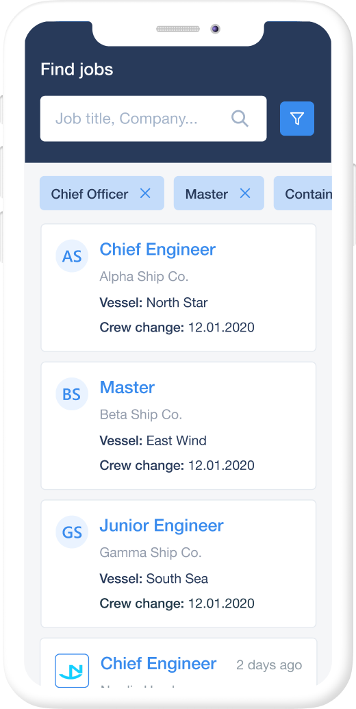
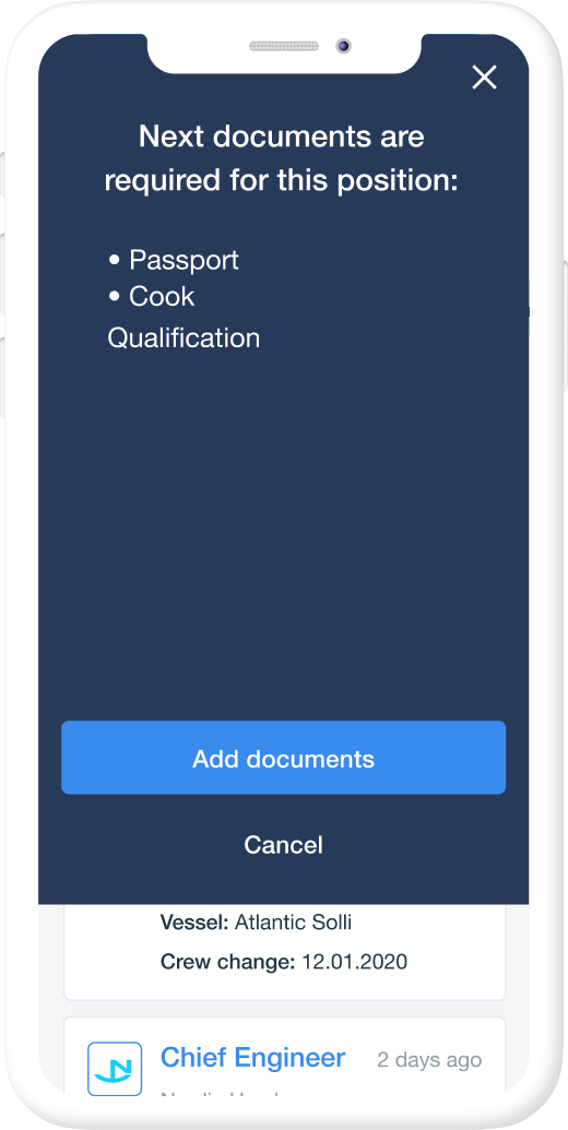
app to find your next job