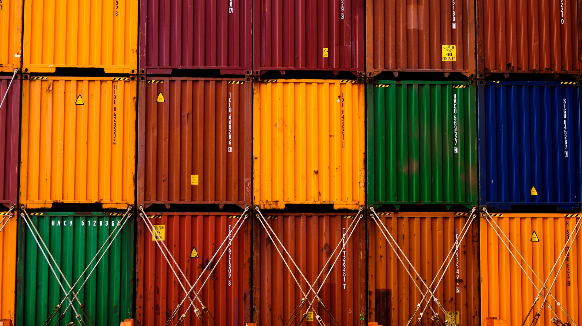
Everything You Need to Know About Shipping Containers
Ever wanted to know absolutely everything there is to know about the humble shipping container? You're in luck - as this blog reveals all!
Read moreGet the lowdown from Martide's blog about different types of commercial vessels, the merchant fleet and all other things shipping and maritime related.
Ever wanted to know absolutely everything there is to know about the humble shipping container? You're in luck - as this blog reveals all!
Read more
The primary priority when a ship is involved in an accident or cannot continue its voyage is to remove the vessel, crew, and cargo from harm's way while avoiding further damage to the environment. But where would they go? Who should help them?
Read more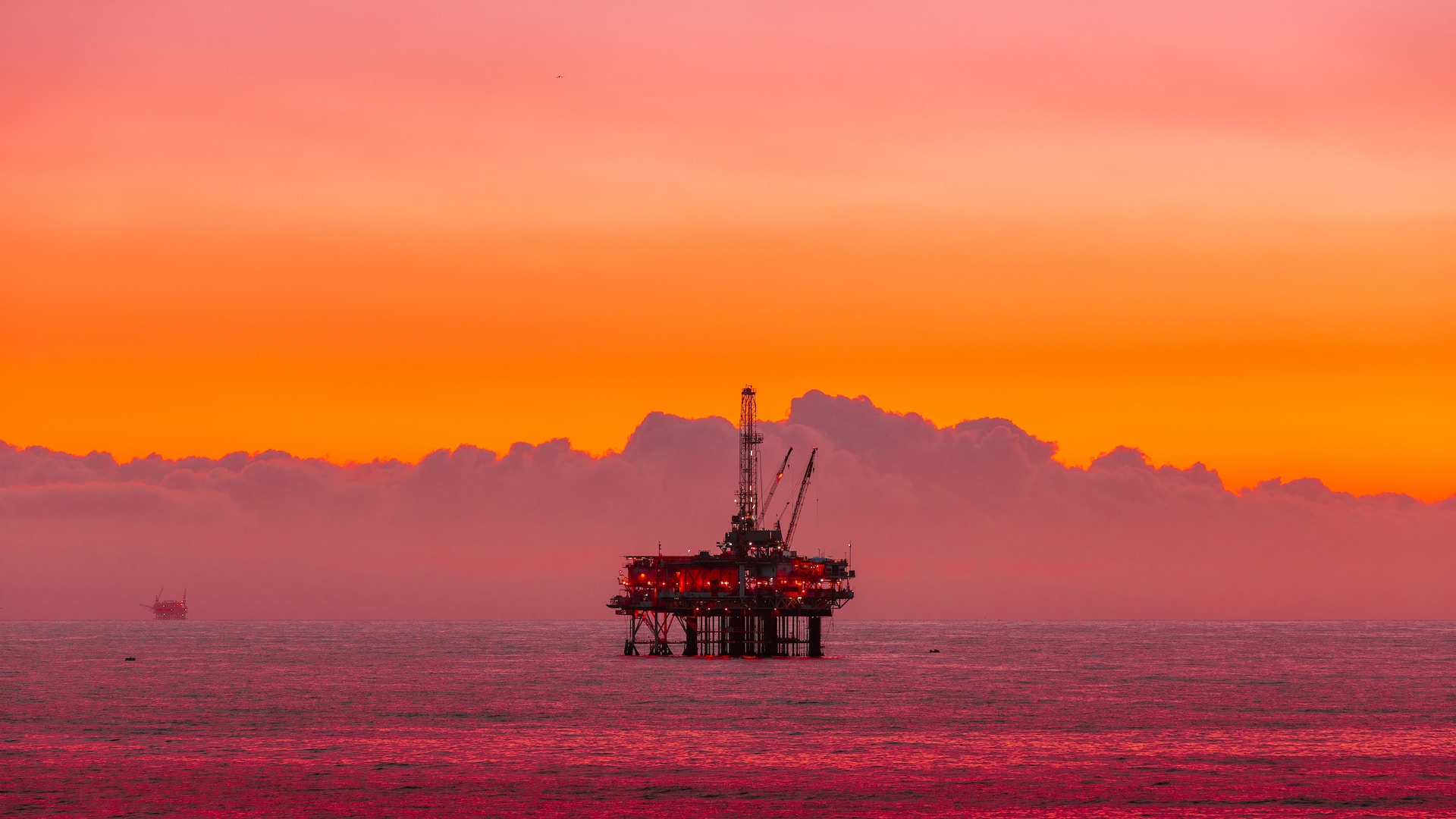
Wondering what an offshore vessel is? This blog post covers offshore supply vessels, offshore support vessels, oil exploration vessels and more.
Read more
You might be surprised to know how maritime transport started with hollowed logs in ancient times and turned into the behemoth ships that we have today.
Read more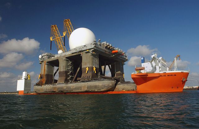
A heavy lift vessel (HLV) is a huge freight ship designed to carry cargo that goes above and beyond the size and weight of the kind of items usually found on a container ship. Think: Dredging equipment, floating dry docks and plants, drilling rigs, offshore structures and even other vessels.
Read more
Aside from container ships, one of the most commonly spotted vessels at sea is the bulk carrier. Unlike container ships which transport goods in - you guessed it - shipping containers, bulk carriers carry loose cargo in huge (bulk) quantities. A Supramax vessel is a type of bulk carrier.
Read more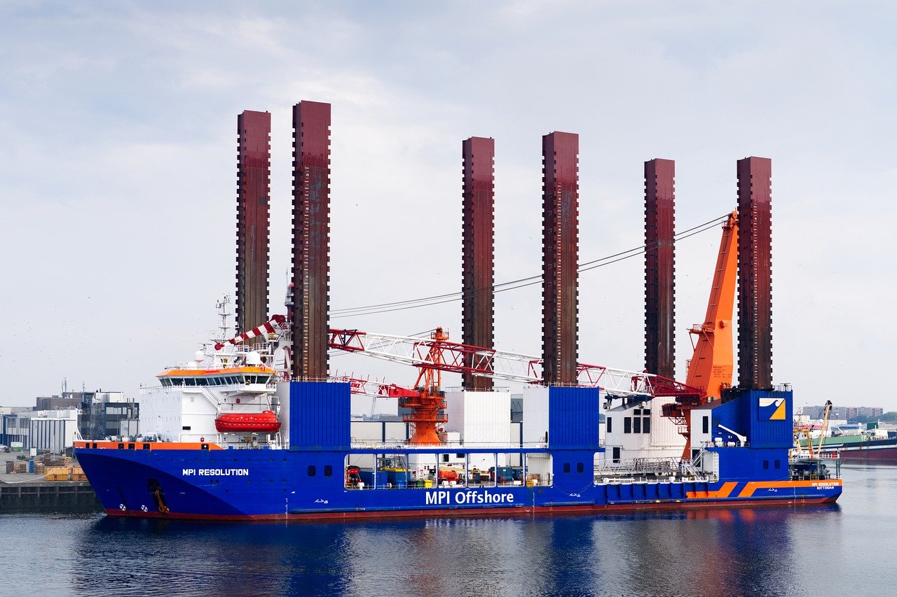
As you have probably guessed from its name, a crane vessel - also known as a floating crane, crane ship or heavy lift vessel - is an ocean-going vessel which has one or more cranes mounted on to it. These gigantic ships are incredibly powerful and can handle extremely heavy loads.
Read more
Why do ships use port & starboard instead of left & right? How do you remember which is port & which is starboard? Our blog post has the answers!
Read more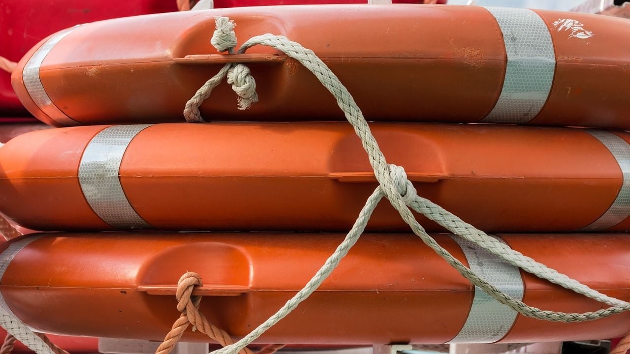
Ever since ships began trading internationally there have been people seeking a better life for themselves, or fleeing war or persecution - but who don’t have the financial means. But recently the problem is increasing as more people are willing to take the very real risks involved in stowing away.
Read more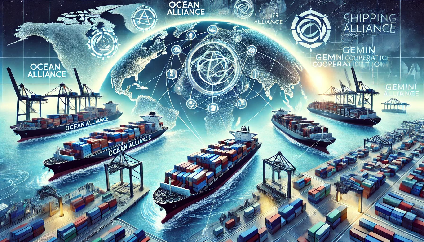
Ever wondered what shipping alliances are, what they do and who they benefit? Read on for a deep dive into these strategic maritime partnerships.
Read more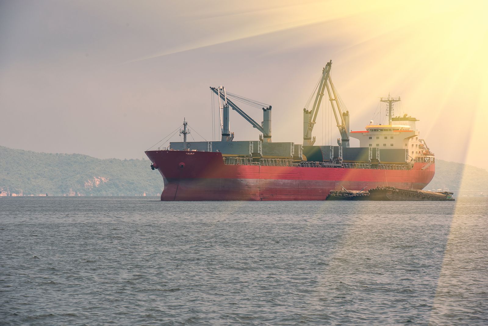
You might have heard of 'sea trials'. But what are sea trials, why are they important and what do they actually involve? At sea, there are any number of factors affecting a voyage so it's crucial for shipowners to be prepared for anything. And this is where sea trials come into play.
Read more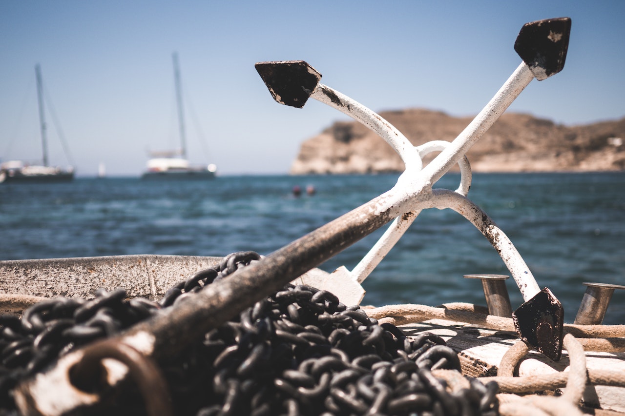
What happens when an anchor is lowered but the ship doesn't stay in place? That is called a dragging anchor & we will discuss this in this post.
Read more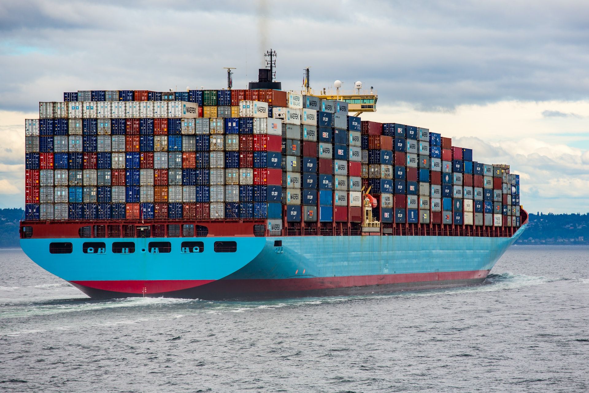
Containers are an integral part of shipping and logistics. They are used to transport a wide range of goods around the world, ranging from consumer goods like electronics and clothing to industrial goods like machinery and raw materials.
Read more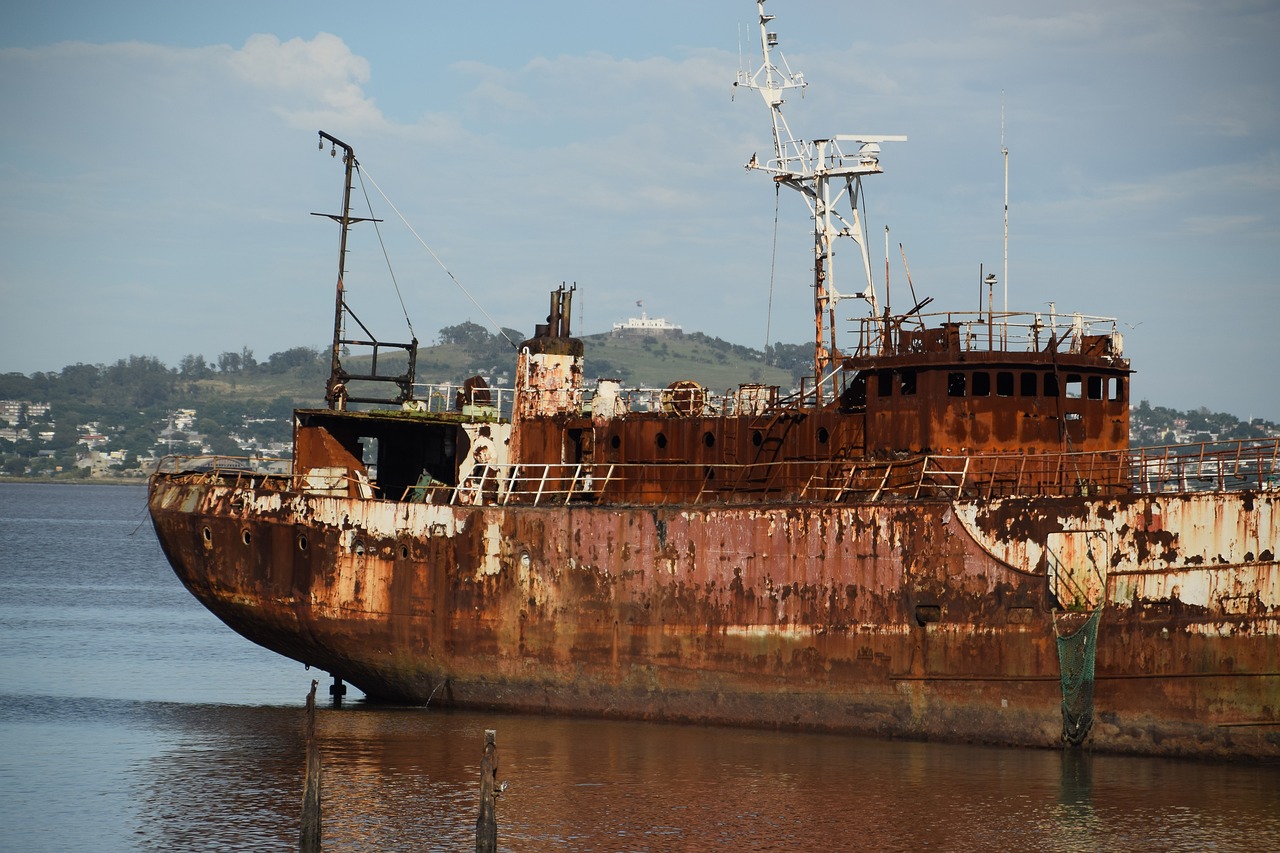
Marine salvage is the process of retrieving, rescuing, and repairing a ship – saving also its crew, cargo, and other properties – after a shipwreck or any other maritime accidents.
Read more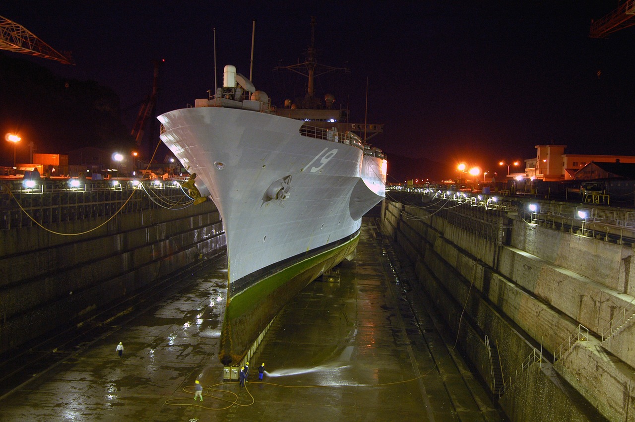
Every machine needs regular maintenance, repairs, and upkeep to operate efficiently. The procedure used for routinely maintaining and repairing ships, boats, and other watercraft is called dry docking.
Read more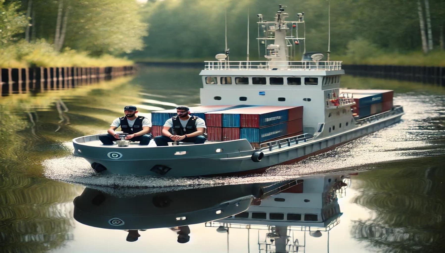
Simulators, time at sea and maritime academies are all ways cadets gain experience before working at sea. Now say hello to miniature cargo ships!
Read more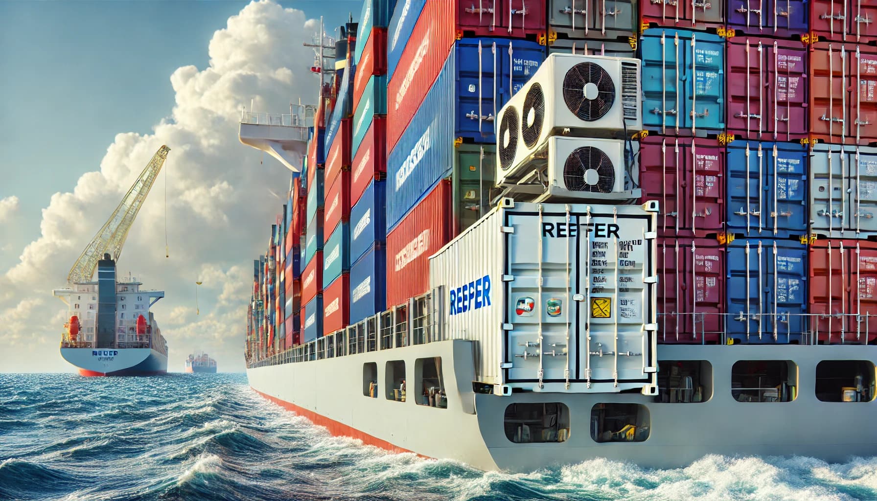
Did you know that about 40% of food is wasted before consumption during shipping? Read this to find out how perishable goods are shipped.
Read more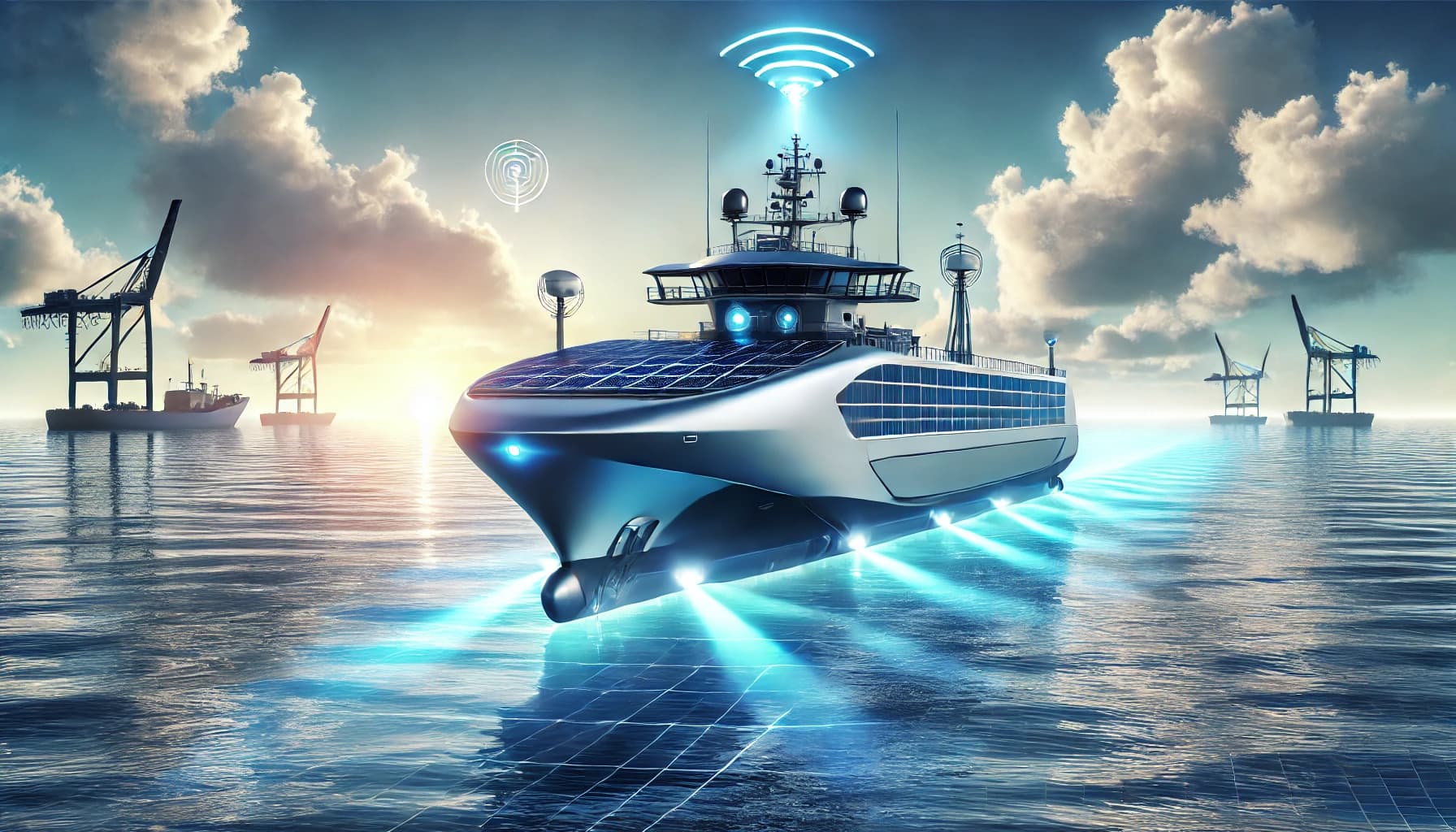
Driverless cars have been making headlines for a while now but while the roads of our cities are yet to be populated by autonomous vehicles the technology is proving it’s not just a flash in the pan - so when will we see marine tech such as smart ships making waves?
Read more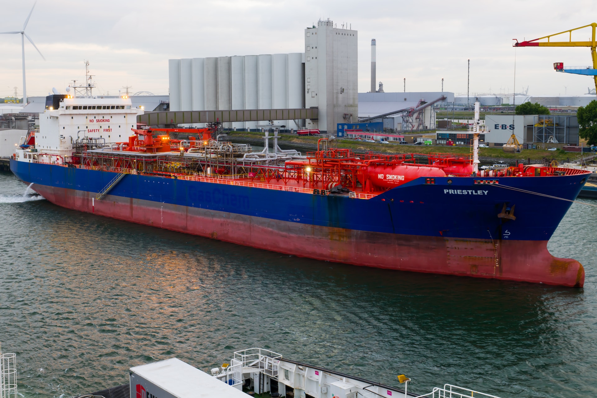
Want to know what LNG & LPG tankers are? If so, you’re on the right blog! We’re looking at LNG & LPG ships and seeing what they transport and how.
Read more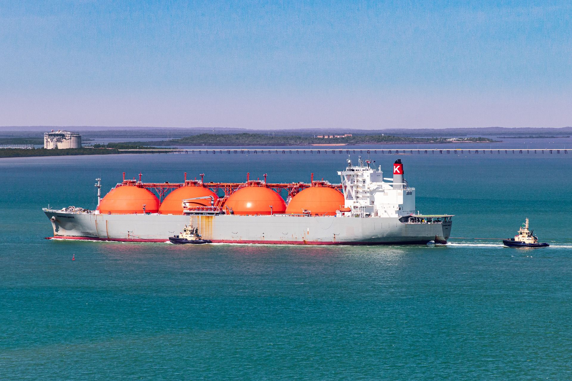
A gas carrier ship, also known as a gas tanker, LPG/LNG tanker or LPG/LNG carrier is a vessel that has been designed specifically for the purpose of carrying bulk quantities of liquefied petroleum gasses (LPG) or liquefied natural gasses (LNG) from one destination to another.
Read more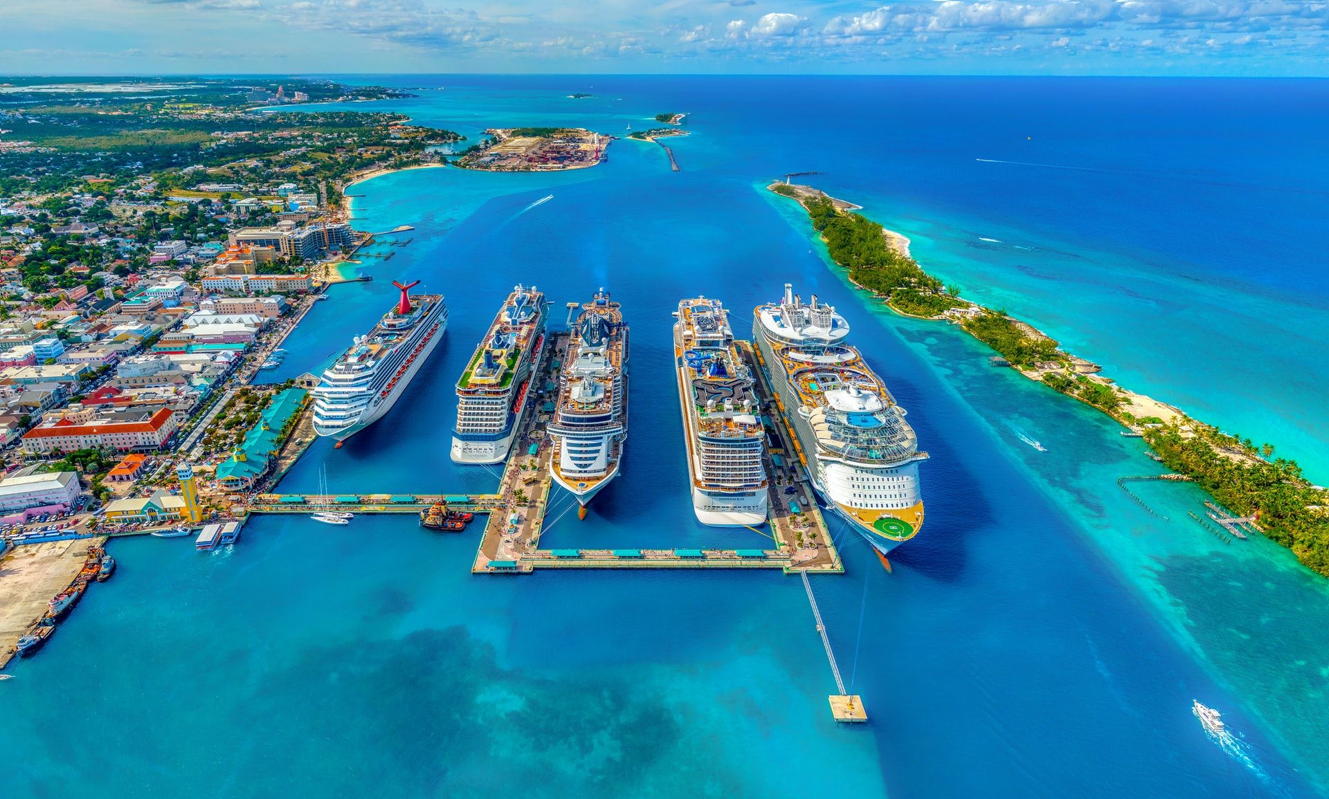
A cruise ship is a passenger ship that sails to a number of different destinations. The pleasure of the voyage being the point. Cruise ships are synonymous with being luxury vessels & their amenities, activities, dining options & entertainment are all created with the passenger experience in mind
Read more
In this post we’re going to be taking a look at one of the lesser known merchant ships: The mining vessel. So if you’ve ever sat down and Googled “what is a mining ship” or “what is a mining vessel” you’re in luck!
Read more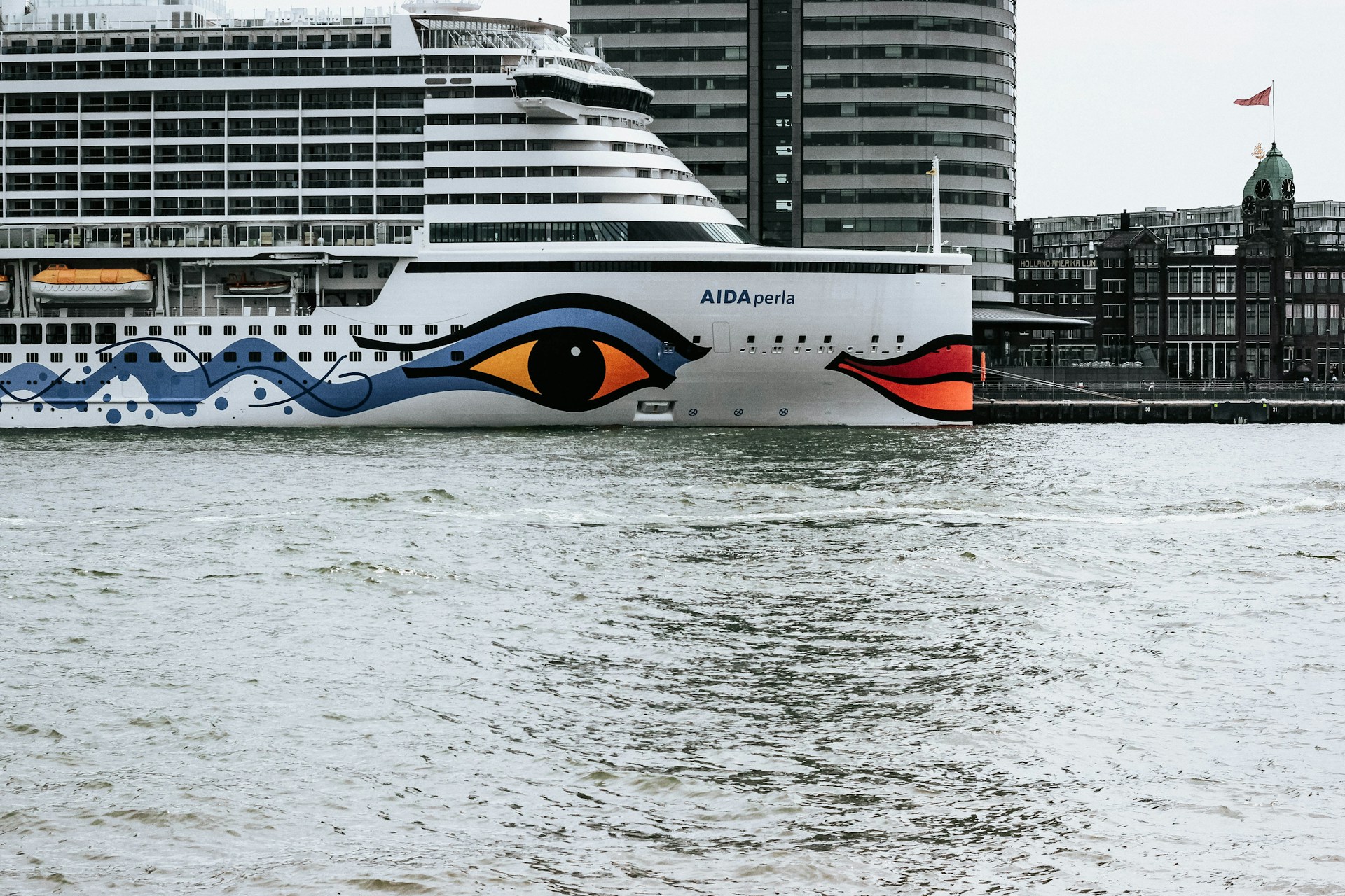
In the past sailors would spend a lot of time at sea and would develop strong attachment to their ships. As a result, it was typical for them to refer to their ship with affection. Seafarers were said to be "married to the sea" and frequently named their ships after the women they cherished.
Read more
A car carrier or car carrier ship is a vessel that’s been designed for the transportation of either just cars, or a combination of cars, trucks, buses and other wheeled vehicles. Car carriers are a type of RoRo ships - which means Roll-On, Roll-Off, as this is how their cargo is loaded and unloaded.
Read more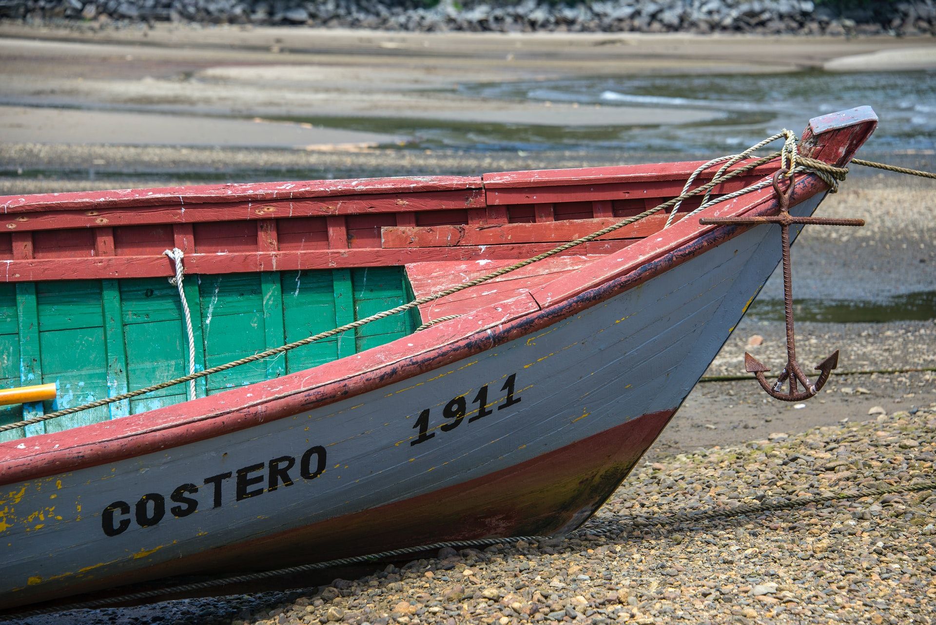
Virtually every vessel is named, whether it’s a merchant navy cargo or container ship, a small yacht used by a family for sailing on their local lake, a canal boat, a military vessel, or a rowboat.
Read more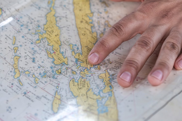
Today, navigation is aided by technology. If you’re pinpointing locations or accessing directions, there’s a high chance you’re using an Electronic Chart Display and Information System AKA ECDIS.
Read more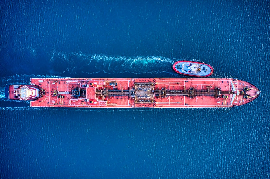
A tanker is a ship that transports liquid cargo in bulk. It doesn’t use containers or barrels but stores the liquid in a hold. The majority of tankers carry oil, hence the name, however some tankers also move edible oils and other liquified food stuffs such as treacle/molasses and drinks like wine.
Read more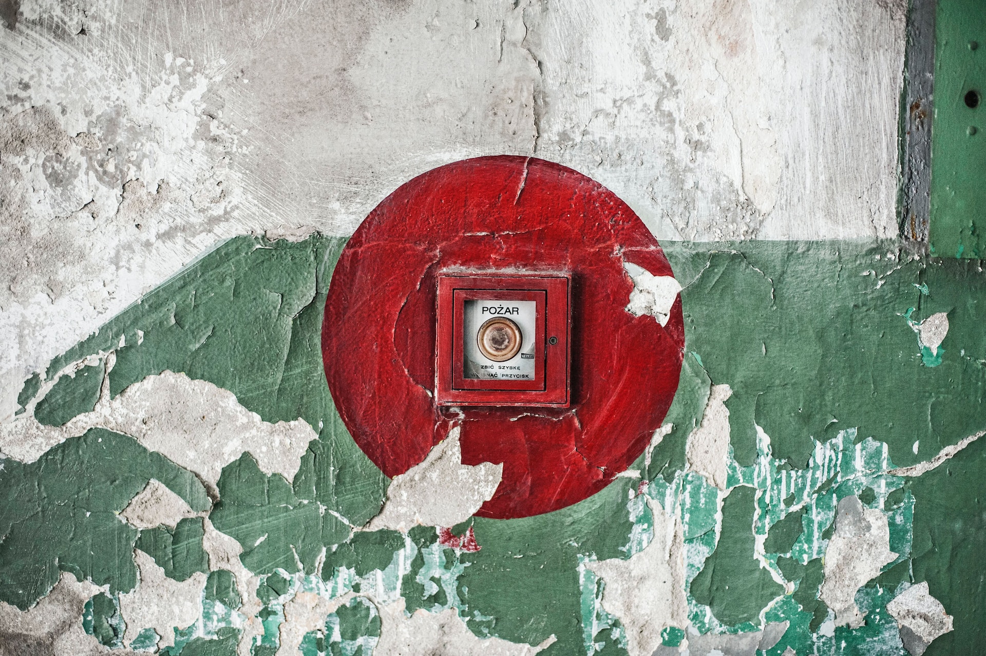
Coupled with fickle weather, treacherous seas, and a dose of manmade error, life at sea can be challenging and risky. But that's where your ship's emergency signals and alarms can help. They can assist the crew in responding appropriately to a crisis or preventing an issue.
Read more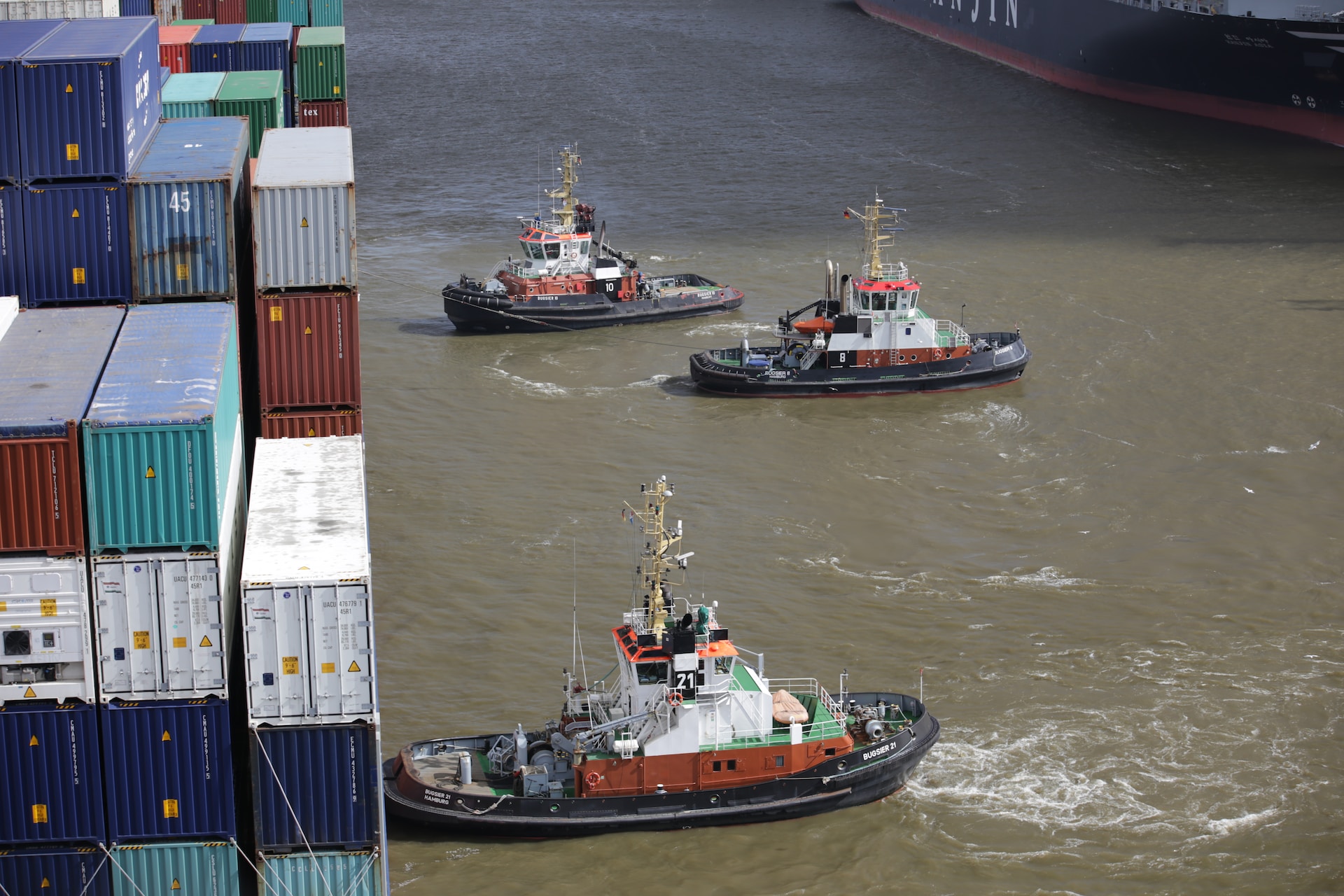
Tugboats are small powerful vessels with a number of tasks, mainly the towing or pushing of much bigger ships. But there's more to it than that!
Read more
Want to find out how SAP can help your maritime company increase efficiency & compliancy while letting you make data-driven decisions? Read this.
Read more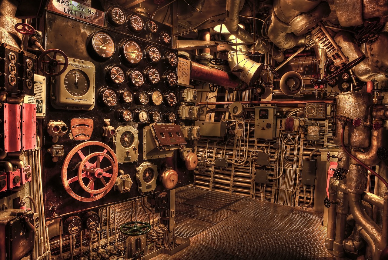
An engine room typically consists of three platforms—the top, middle, and bottom But what is on each of those platforms? And why are they located there?
Read more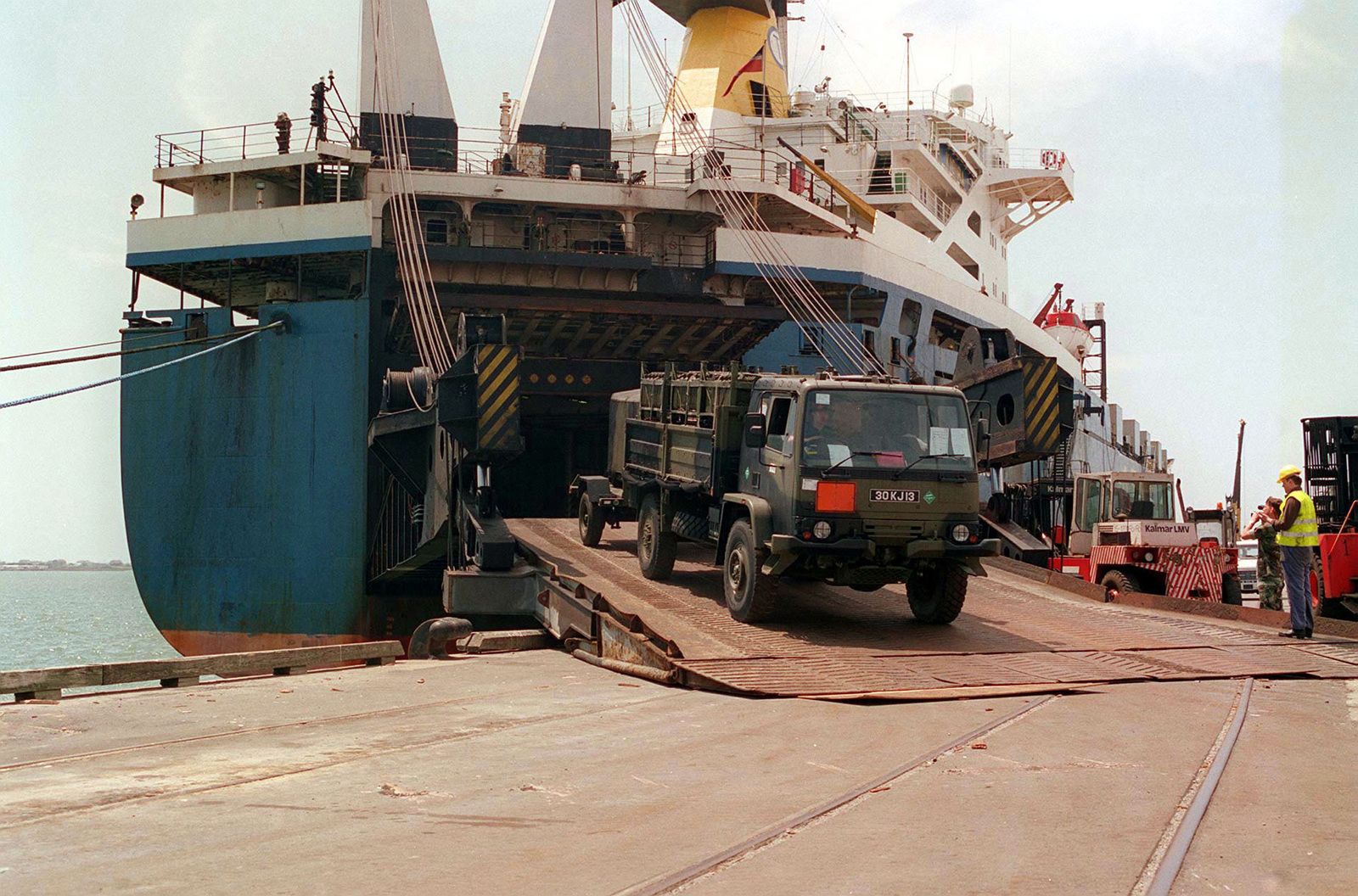
Do you want to know what a RoRo ship is? If so, you’ve come to the right place. RoRo stands for roll-on / roll-off which means it’s a vessel that has been designed to carry wheeled cargo: Think cars, vans, trailers, busses and trucks. Anything that can be ‘rolled on and then rolled off’ the ship.
Read more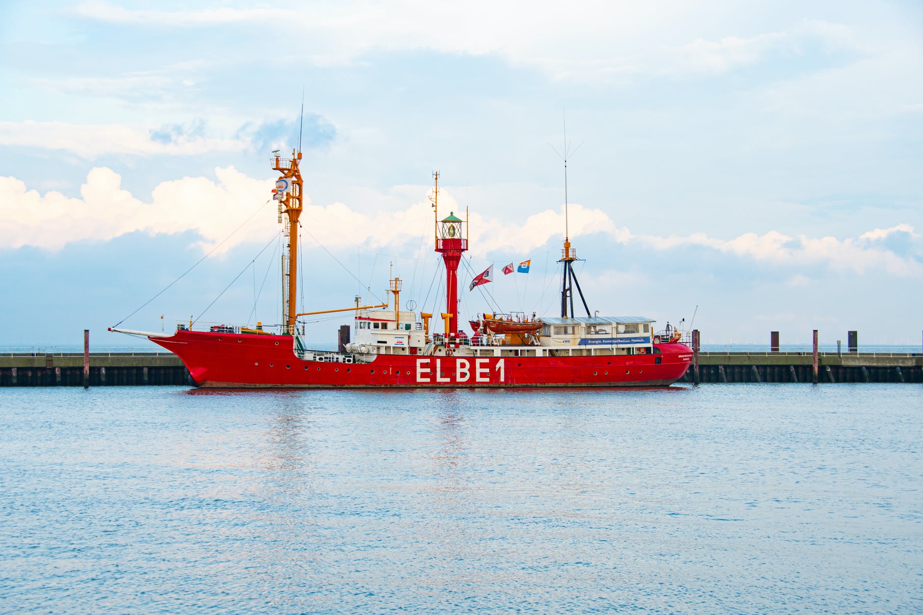
A lightship, or lightvessel, is a ship fitted with a beacon on a mast that functions in the same way as a lighthouse: To act as a warning and to help other vessels safely navigate at night or in fog. Lightships are commonly used in waters that are too deep for a lighthouse to be constructed.
Read more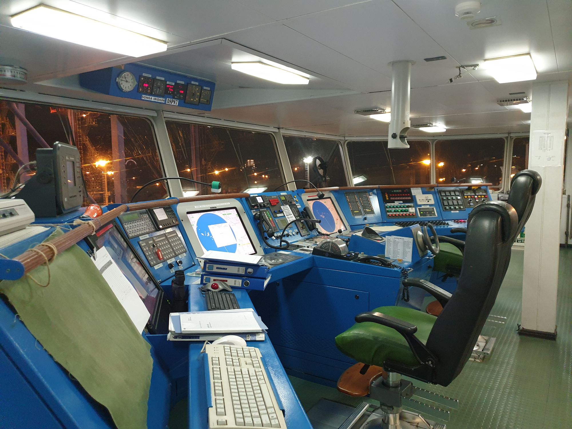
In this post we thought we’d take a look at some of the different ways that crews on vessels today navigate so that they, and their cargo (and passengers, if any) can safely and accurately reach their port of destination.
Read more
July 1st was World Marine Aids to Navigation Day so what better topic to cover? What is World Marine Aids to Navigation Day & why did it begin?
Read more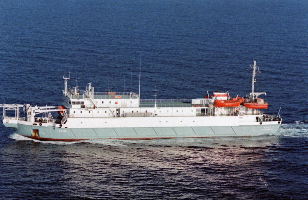
Want to know what a cable laying ship is? Cable ships are deep sea going vessels which are designed to lay underwater cables on the sea bed.
Read more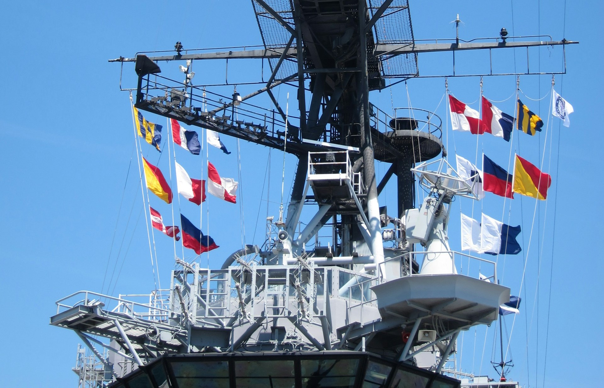
Ever wondered what those colored flags flown by boats and ships on their masts are? They're nautical flags and this blog explains what they mean!
Read more
A chemical tanker is a type of cargo ship that has been specifically constructed, or adapted, to carry liquid chemicals in bulk. They are the main form of transport when it comes to moving the commodities that provide the world with its energy requirements from point A to point B.
Read more
Heard about the cargo ship that lost nearly 5 million pieces of Lego overboard? This is all you need to know about the Tokio Express Lego spill!
Read more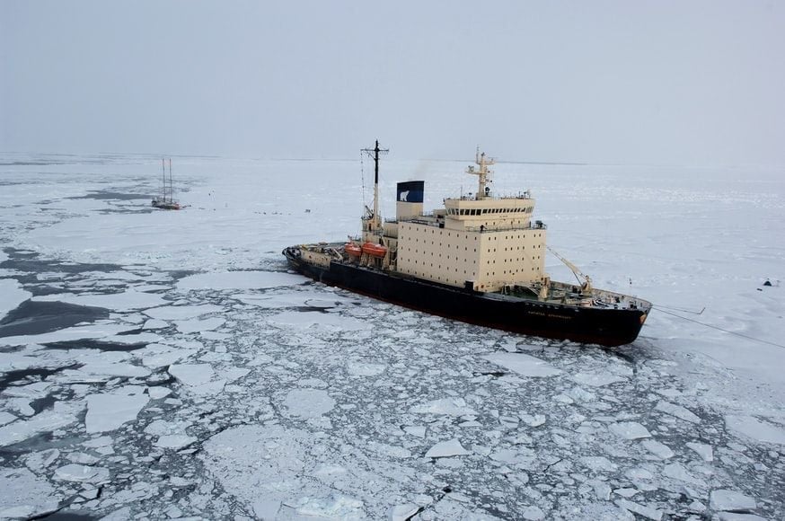
As the name suggests an icebreaker ship breaks ice in water. But there's more to this vessel. Find out what an icebreaker boat does in this post.
Read more
The introduction of the ship container shook maritime transport and the industry to its core. Sure, boxes revolutionized it but they also effected employment figures. A similar transition is happening with the rise of eCommerce and automation of the industry: what’s changing the future this time?
Read more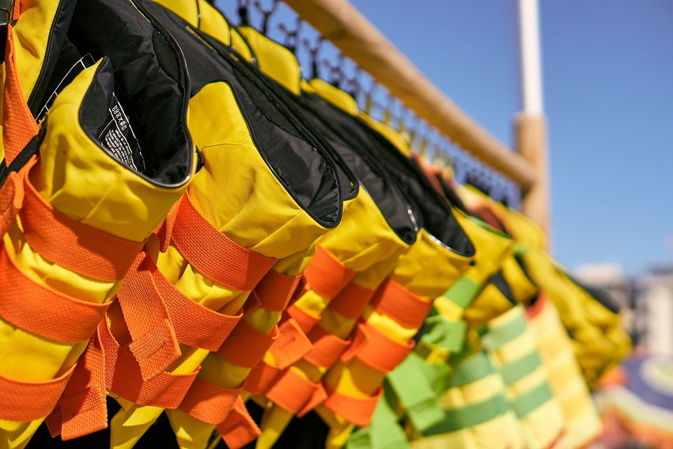
According to the dictionary, a life jacket is a life preserver in the form of a buoyant jacket. This sleeveless inflatable jacket is also known as a personal flotation device and it aims to prevent drowning by keeping the wearer afloat when water-related accidents occur.
Read more
It’ll come as no surprise that there’s a whole host of different boats, ships, vessels, and other watercraft out there. From the smallest canoe to traditional sailing clippers and from cargo ships to icebreakers and fishing boats, there’s no end of topics to explore. Which is what we’re going to do!
Read more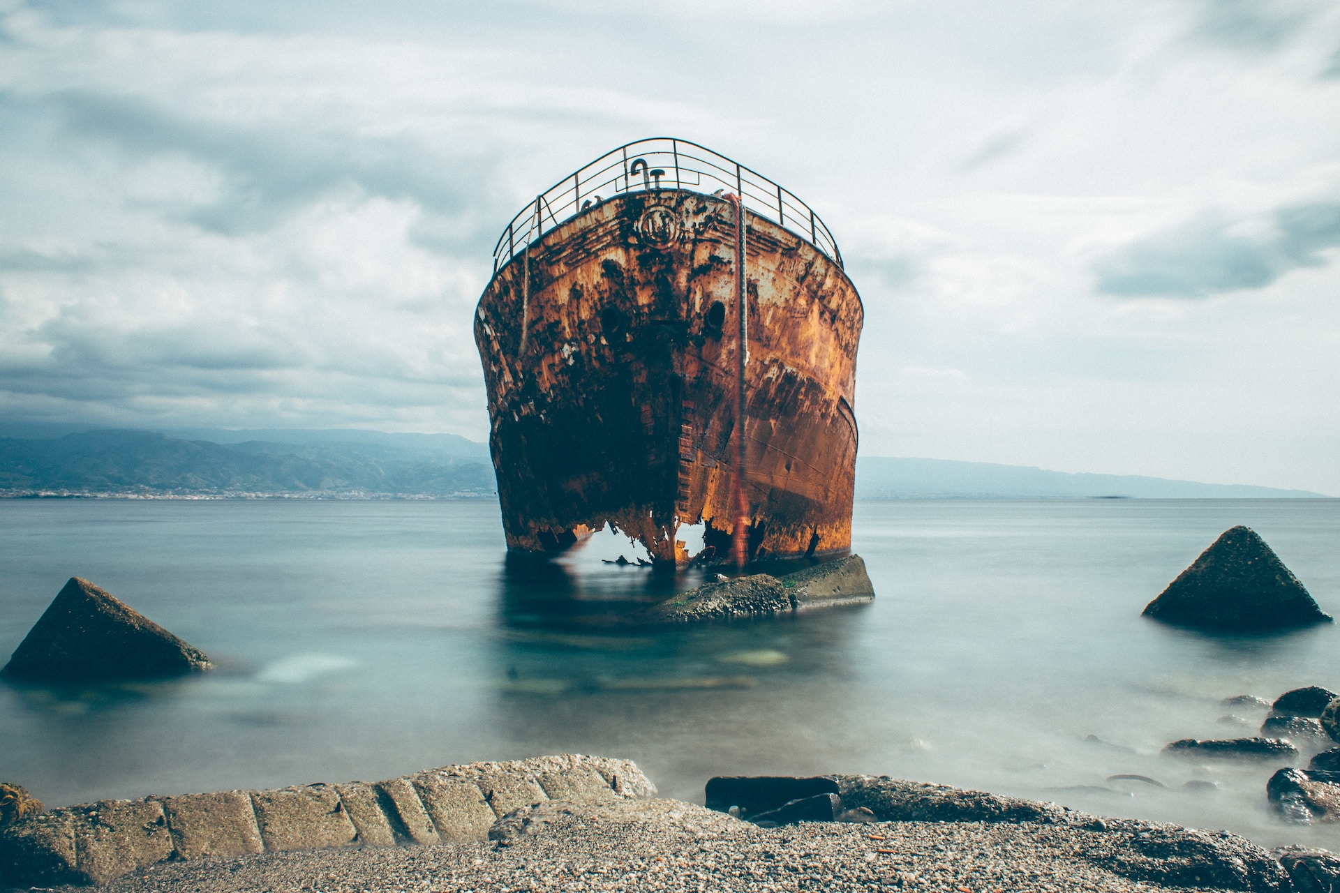
In the maritime industry champagne bottle smashings are used to mark the birth of new ships but the fate of retired ships is rarely discussed.
Read more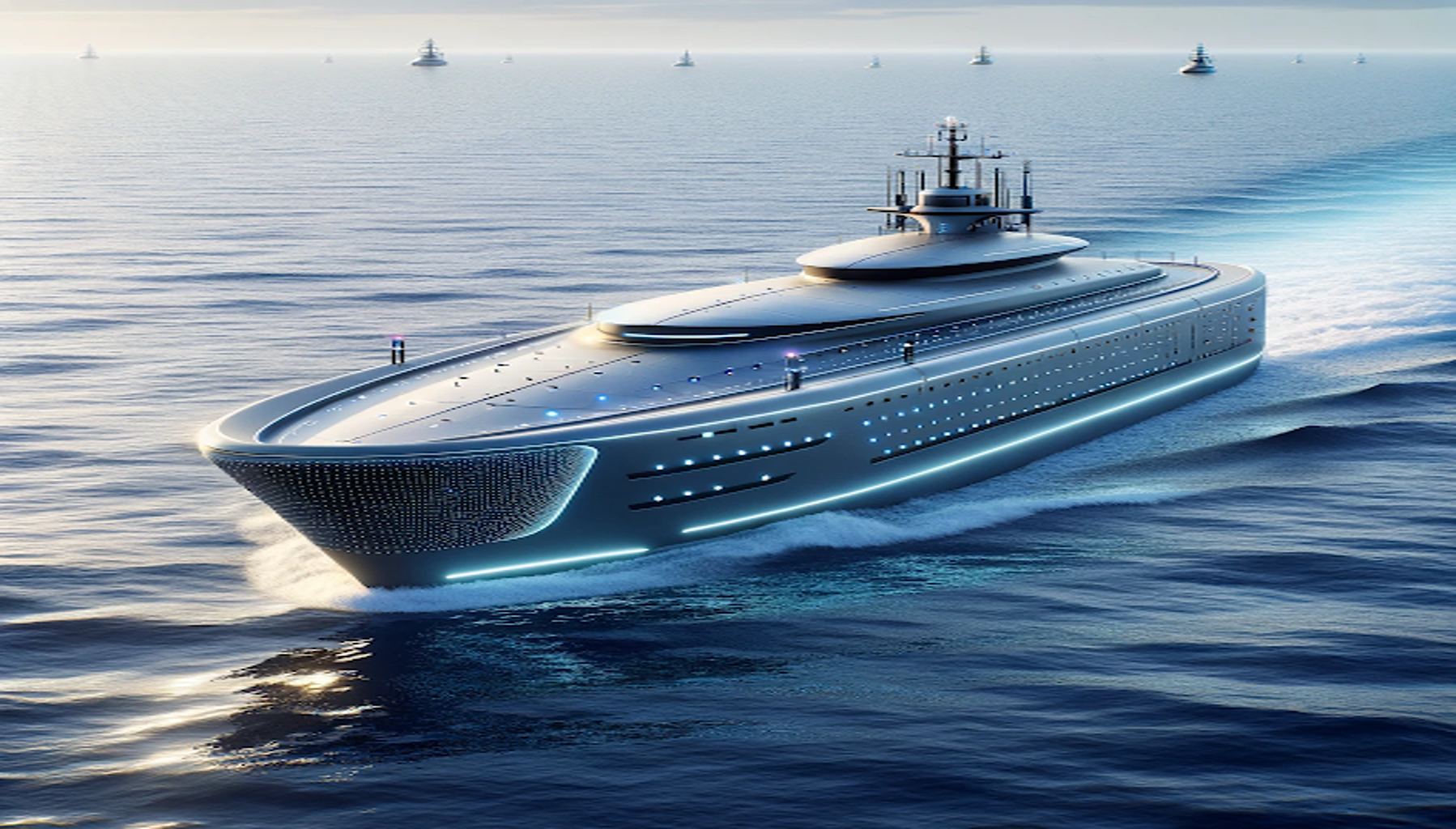
Autonomous ships and smart ships are buzzwords that have been doing the rounds in the maritime industry recently. And it’s not surprising that many have expressed concern for the future of seafarer jobs. But the rise of self sailing ships doesn’t necessarily mean the end of the mariner. Here’s why.
Read more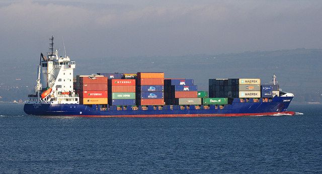
A feeder vessel is a medium size container ship. Its job is to collect shipping containers from a port and transport them to transhipment hubs or central container terminals so they can be loaded onto larger vessels to complete their journey or onto other vehicles so they can be transported inland.
Read more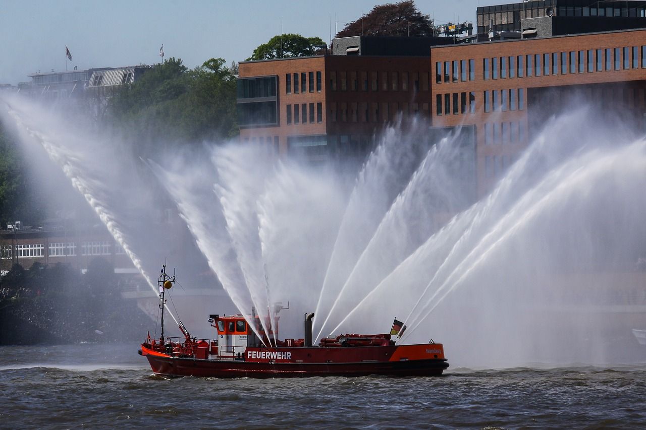
The water-based or offshore cousin to a fire engine or fire truck, the fireboat is a vessel that has onboard equipment, such as nozzles, hoses and pumps, that are used to fight and extinguish fires both on other ships, as well as along the coastline, on docks and in ports and warehouses.
Read more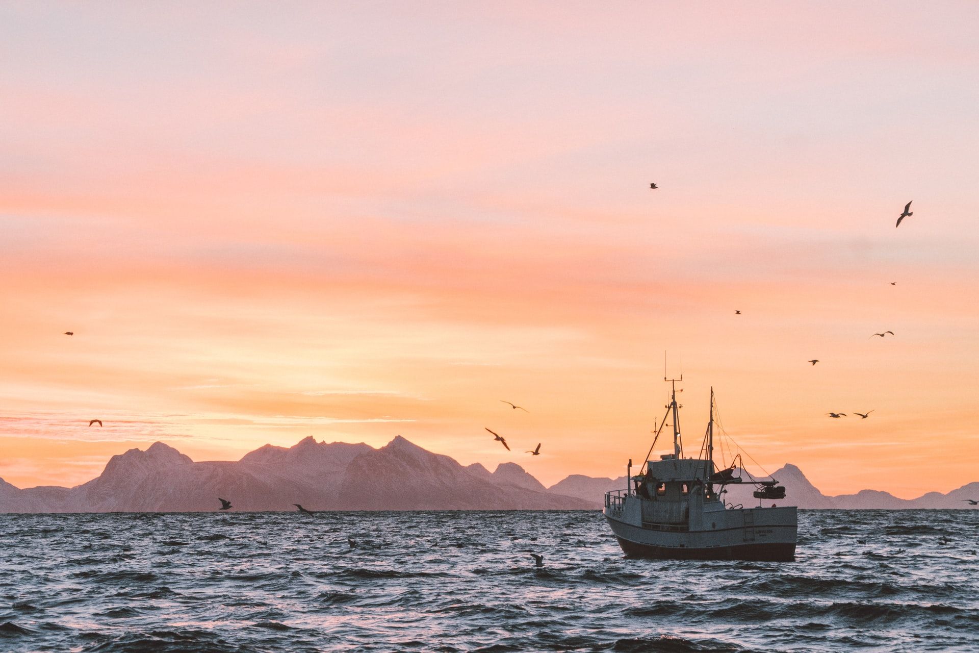
We all know a fishing vessel is a boat used to catch fish, whether that’s on the sea, a lake or a river. It goes without saying that fishing boats vary in size and complexity, but what you might not know is that they can be broken down into a number of main categories and then subcategories.
Read more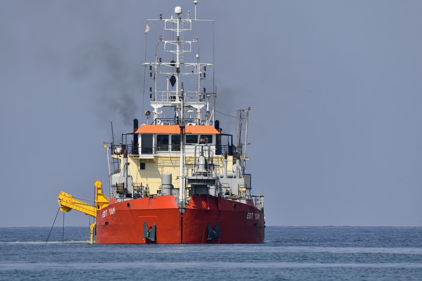
A dredger is a boat equipped with a tool that sucks, excavates or scrapes sediment like sand, silt, gravel, trash, rocks, debris and animal and plant matter from the sea bed or a river, estuary or canal. The materials moved are placed elsewhere or disposed of in an act known as dredging.
Read more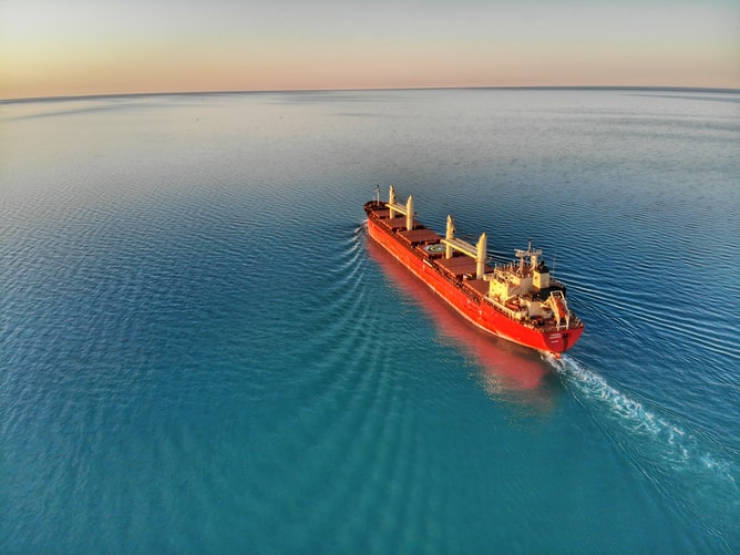
A bulk carrier, bulker, or bulk freighter is a type of merchant ship that transports dry goods in bulk that are not packed into containers, drums or other packaging. We’re talking about cargo such as grain, cement, coal, ore and even sugar.
Read more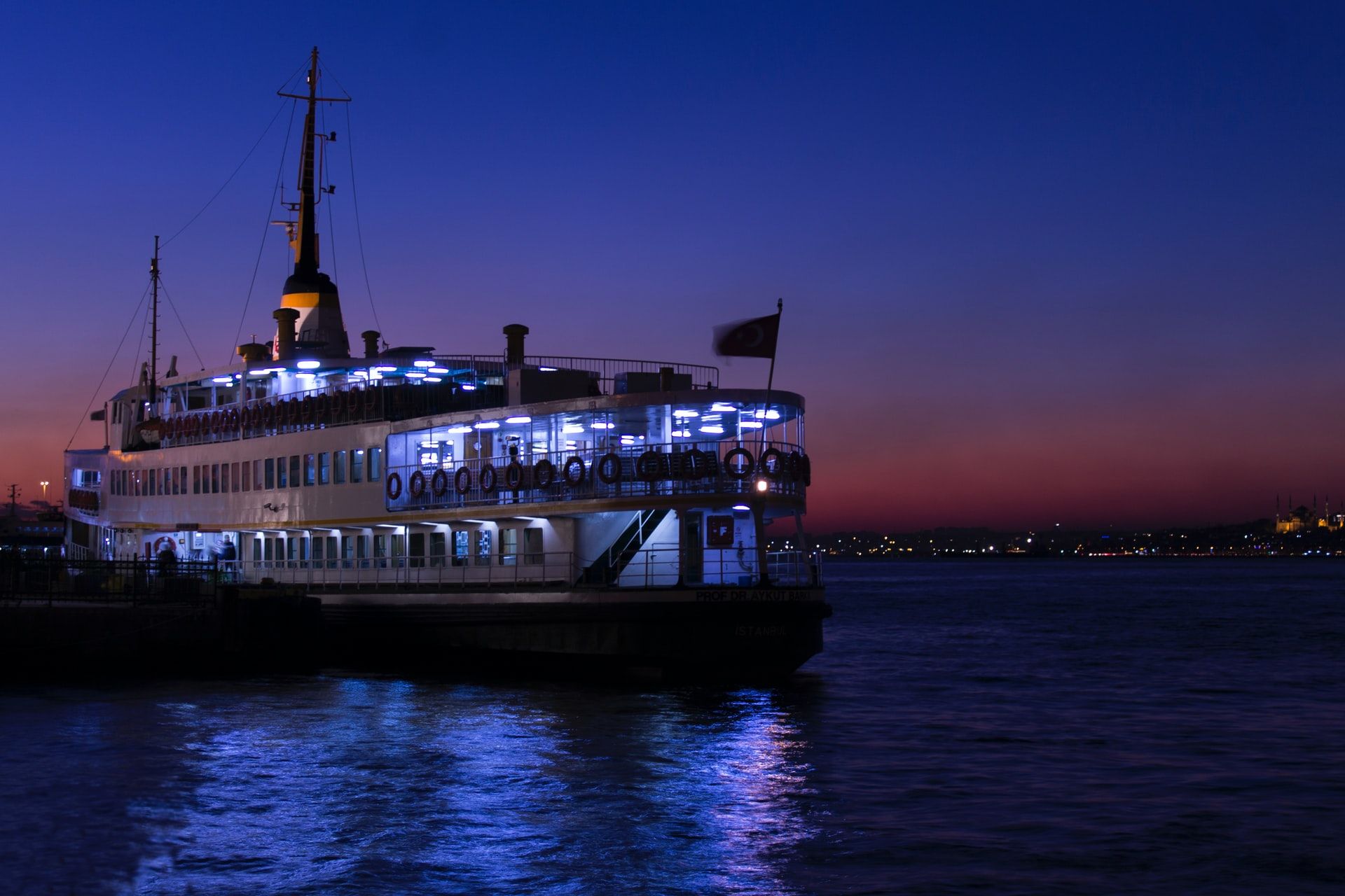
Ferries are mainly known as a type of boat that transports passengers from one place to another, and, usually, back again. They have more in common with a bus or train than a cruise ship as their main purpose is to provide passengers with transportation for a reason rather than for leisure.
Read more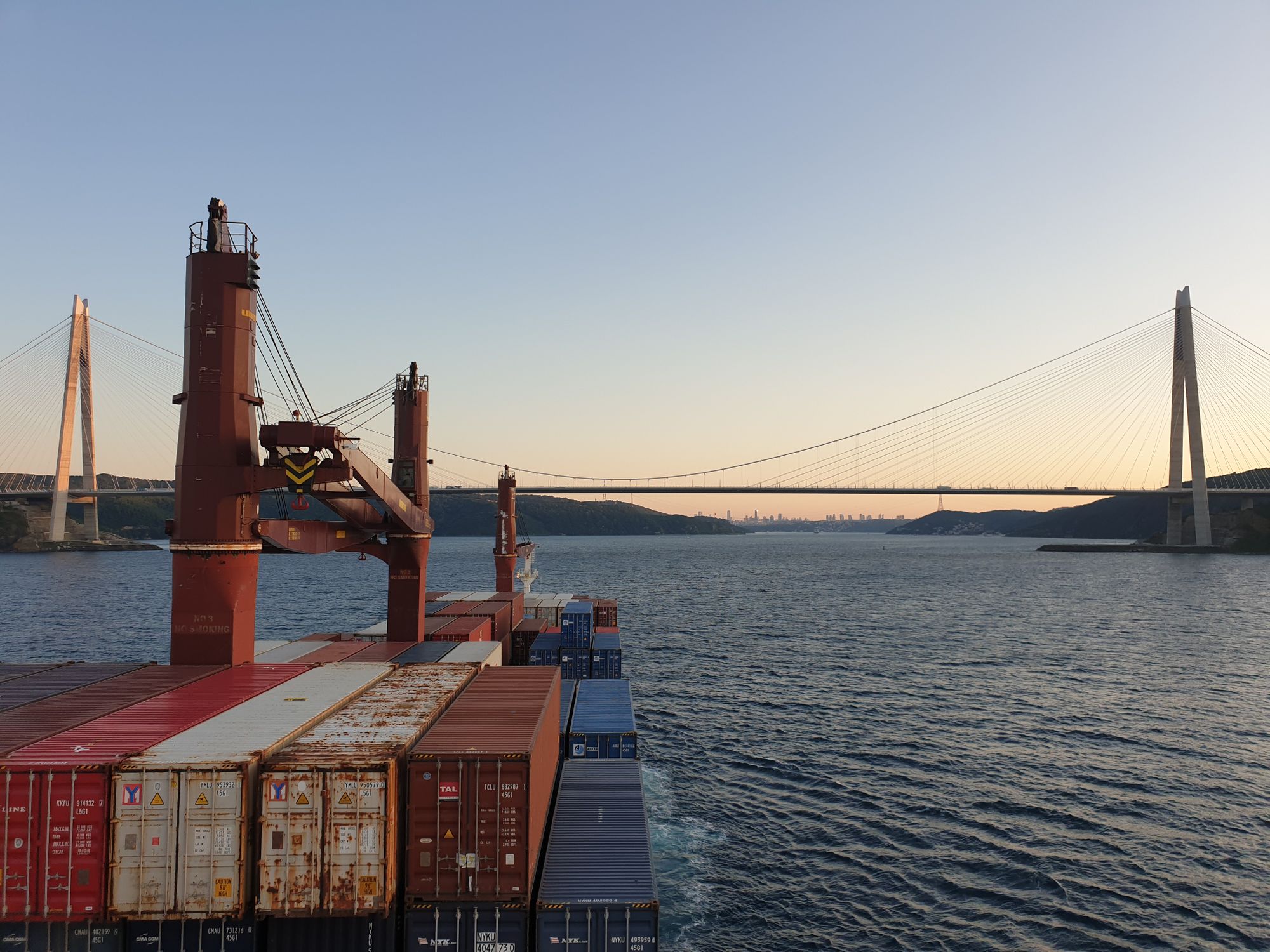
Do you see yourself living life on a container ship? Are you considering a career in the maritime industry? Maybe you just want to know what life on a vessel is like? Our office-based coworker recently spent a week on a cargo ship and this is a unique insight into day-to-day life at sea.
Read more
What are Aids to Navigation (ATONs) in the maritime industry - and why should seafarers always be mindful of them? Let’s find out!
Read more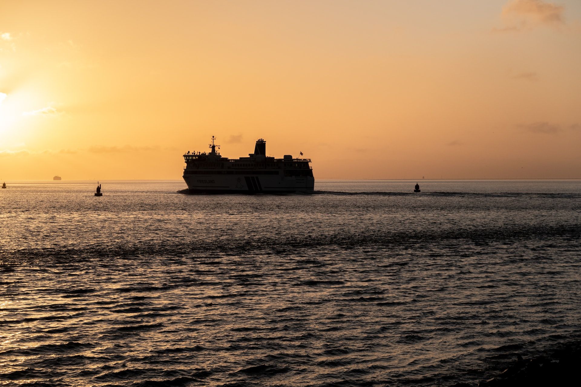
There are numerous types of boats and ships plying their trade across the world’s oceans, from small pleasure craft to fishing boats and from superyachts to warships. Here at Martide, we’re interested in the types of ships you’ll find in the merchant navy.
Read more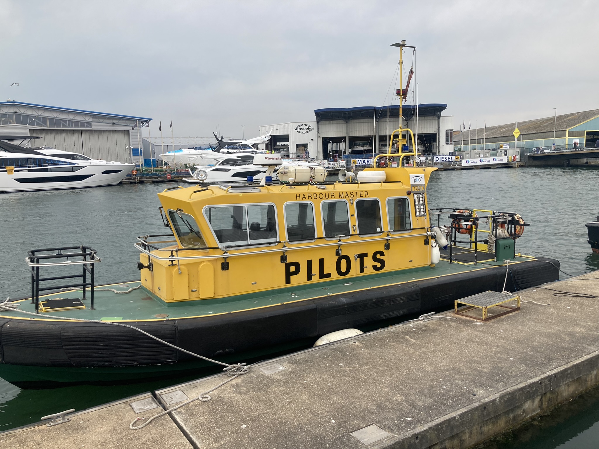
Ever wondered what a pilot boat and a marine pilot’s job is? This is the blog post for you. Read on as we take a look at pilotage and pilot boats
Read more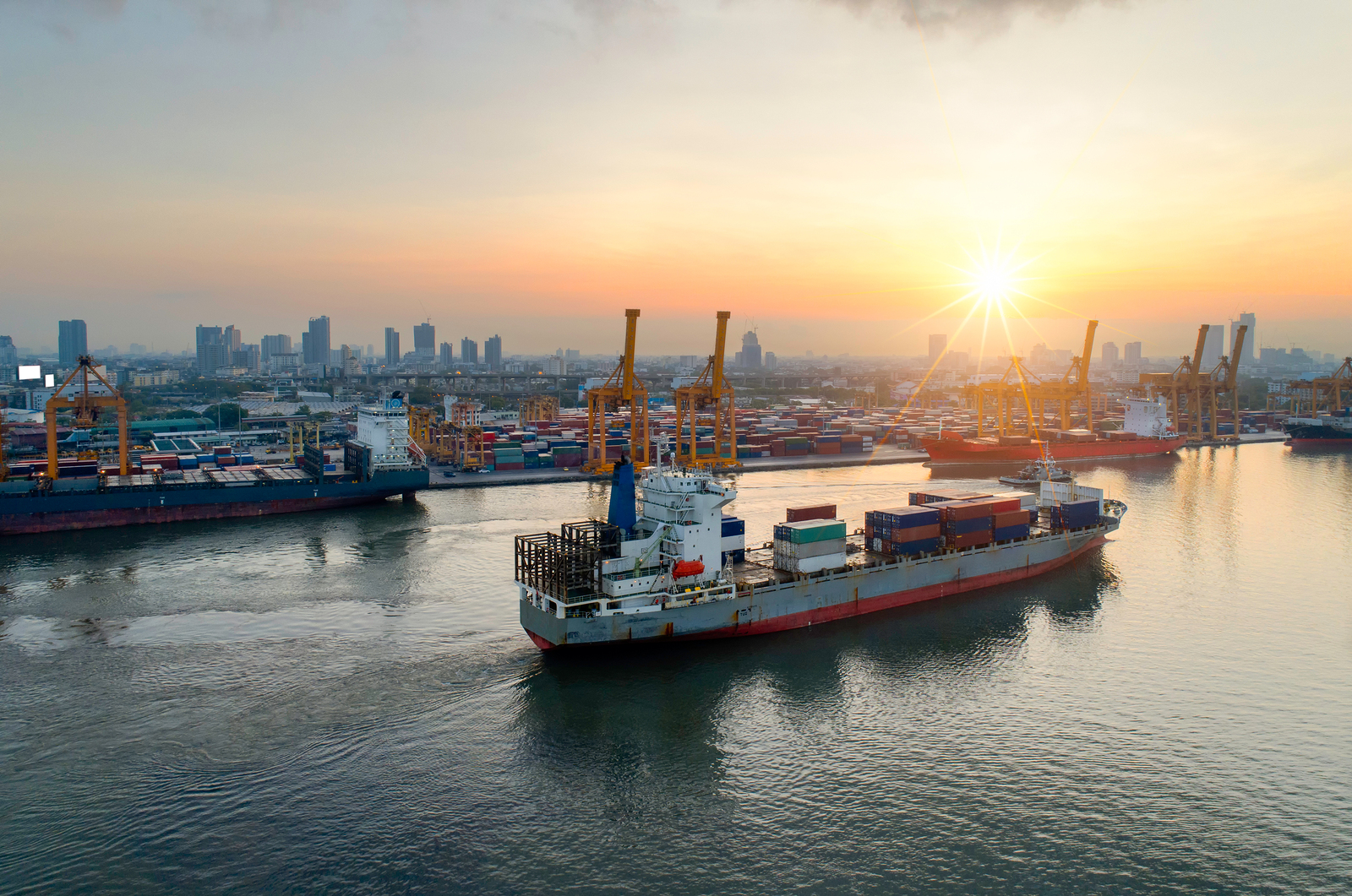
Ever wondered what a coaster vessel is? This article is one in a series of posts about the merchant fleet and covers coastal sailing ships.
Read more
You think you've seen it all, from opulent cruise ships with 5-star superior suites and eco-retreats with activity programs removed from the mainstream tourists. However, have you ever thought about taking a journey in the "Container Class"?
Read more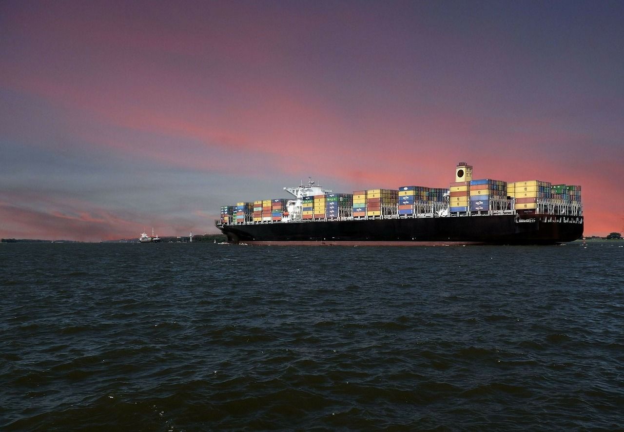
Ever wondered what the difference between a cargo and a container ship is? Ever wanted to know exactly what a cargo ship is and whether or not there are different types of cargo and container ships? You’ve come to the right place! Join us as we take a deep dive.
Read more